GymBeam checkout: UX audit and order review design
How I selected two priorities from a checkout UX audit, wrote development briefs and used AI to build a local order review prototype.
In this article
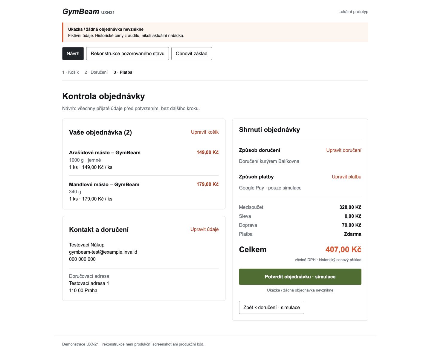
In the tested GymBeam.cz checkout, customers could review products by returning to the previous step. The Payment step itself did not show the individual products or contact details. I therefore proposed an order review where the customer confirms the order. The work produced 12 backlog topics, two detailed priorities and a working local prototype.
What to develop first after the UX audit
The assignment asked for improvements to the basket and checkout, their priority order, two detailed development briefs and a concrete example of working with AI. I needed to distinguish observations strong enough to support a proposal from those requiring further research.
Working with AI, I examined guest checkout and retested selected situations. Most checks used a desktop browser, including a narrow viewport. My own mobile check and recording provided separate evidence. Without access to analytics or production code, decisions relied on observed behaviour and the strength of the evidence.
Products were available one step earlier
I challenged the claim that the order recap was missing: I could see products in the screenshots. We needed to distinguish Delivery from Payment precisely.
Delivery had an expandable product overview with variants and quantities. The documented Payment step retained an item count and price summary. Product rows and contact details were absent; the tested courier delivery path also lacked the address. The selected PPL pickup location was displayed. Going back worked, and the final total was correct.
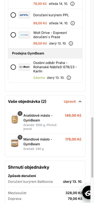
Show the full Payment step

One question remained: would another review appear after pressing the confirmation button? I supplied my own mobile recording. In that recorded path, Apple Pay opened without another product recap. I did not complete payment; we did not verify whether an unpaid order was created or what happened after payment.
The conclusion became more precise: reviewing products was possible, but required leaving Payment. The proposal would allow review and correction immediately before confirmation while retaining the existing flow.
Two priorities out of twelve topics
I prioritised by importance to the customer’s task, evidence strength and the ability to recover from a problem. A working back action matters: it changes both the severity of a finding and the appropriate response.
- Order review in Payment. Develop first. Checking products and contact details required going back from the final step.
- Accessible names for controls. Develop second. Retesting documented specific empty or uninformative names.
An unaccepted contact edit was left for later: retesting confirmed that valid changes were retained and narrowed the issue to an invalid edit. Other topics required confirmation of a business rule or user research.
Ten topics were deliberately deferred. Indicative change sizes still needed technical assessment; without knowing the system, turning them into days or a budget would have been misleading.
Order review must show accepted data
I proposed adding products with variants, quantities and prices, accepted contact details, delivery and the complete price summary before confirmation. Customers could edit each section and return to an updated overview. The number of steps would stay the same.
The development brief also defined acceptance conditions:
- The summary shows data the checkout has actually accepted.
- A valid edit updates the summary. An unfinished or rejected edit is not presented as saved.
- Opening the review or editing details does not itself create an order or initiate payment.
For example, the prototype lets a user increase the quantity of peanut butter and check the accepted quantity and total. The original CZK 407 comes from the documented historical path; increasing the quantity produces CZK 556 in the simulation. Fixed program logic handles the calculations. The prototype has no backend or payment service.
Show the full mobile design

Basket accessibility: what an icon cannot tell you
The second priority concerned basket and form controls. In the retest, quantity buttons, product removal buttons and the quantity field had empty accessible names. Other findings concerned field and consent labels and the association between the email error and its field.
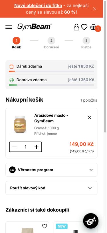
A name should explain the action and the product it applies to. For the Czech interface, I proposed these labels:
- Product plus button: “Zvýšit množství: Arašídové máslo, 1000 g, jemné” (increase quantity: peanut butter, 1000 g, smooth), replacing an empty name.
- Product removal: “Odstranit: Arašídové máslo, 1000 g, jemné” (remove: peanut butter, 1000 g, smooth), replacing an empty name.
A practical screen reader walkthrough remained outstanding. The technical output confirms the missing name; on its own, it does not show how a customer would complete the whole checkout.
AI built the prototype and a bug that needed fixing
My role involved asking questions, challenging findings, checking on mobile and refining the brief. I also requested an independent assessment of the conclusions against the original evidence. AI performed comparisons and retests and implemented the prototype, test data and checks. The prototype does not call a language model while in use.
During its own test, the agent found a specific bug: a quantity change also carried the CZK 556 total into the view labelled as a historical reconstruction. That view was supposed to remain a fixed comparison with the observed state. The agent separated the historical CZK 407 baseline from the proposal’s editable data. The agent found and fixed this bug; it was neither my later intervention nor a deliberately planted experiment.
A later review also led to a contrast correction for small orange text. The main proposal screenshots in this article show the corrected appearance. AI’s contribution here consists of inspectable outputs and documented fixes. We did not measure time saved.
What would come before deployment
With the checkout owner, I would first confirm the sources of accepted data, when an order is created and how supported payment methods behave. Developers would then assess scope and integration with the existing components.
Preparation would also include legal review of the information presented when ordering and the wording of the binding action.
User testing would check whether people can independently find and correct a mismatch and whether an error-free order remains clear. Practical testing with a screen reader, on a physical phone and with native browser zoom would be required.
This work produced priorities, development briefs and a local prototype. Conversion growth and error reduction were not measured. Business impact would be evaluated only after implementation, using available analytics and a measurement approach defined in advance.
What is worth changing in your checkout
At vors.studio, we can examine a specific purchase journey, separate documented problems from hypotheses and prepare priorities and a brief for your team or supplier. That work can begin with a Diagnostic.